Richcraft Rentals
Overview
I was given the opportunity to re-design Richcraft Rentals while working at Richcraft. This project was an excellent opportunity for me because it was my first time working on a website design with an outside agency named Simple Story. I was given the opportunity to try out a Creative Director role by not only being in charge of the creative look but also facilitating all communications between Richcraft and Simple Story.
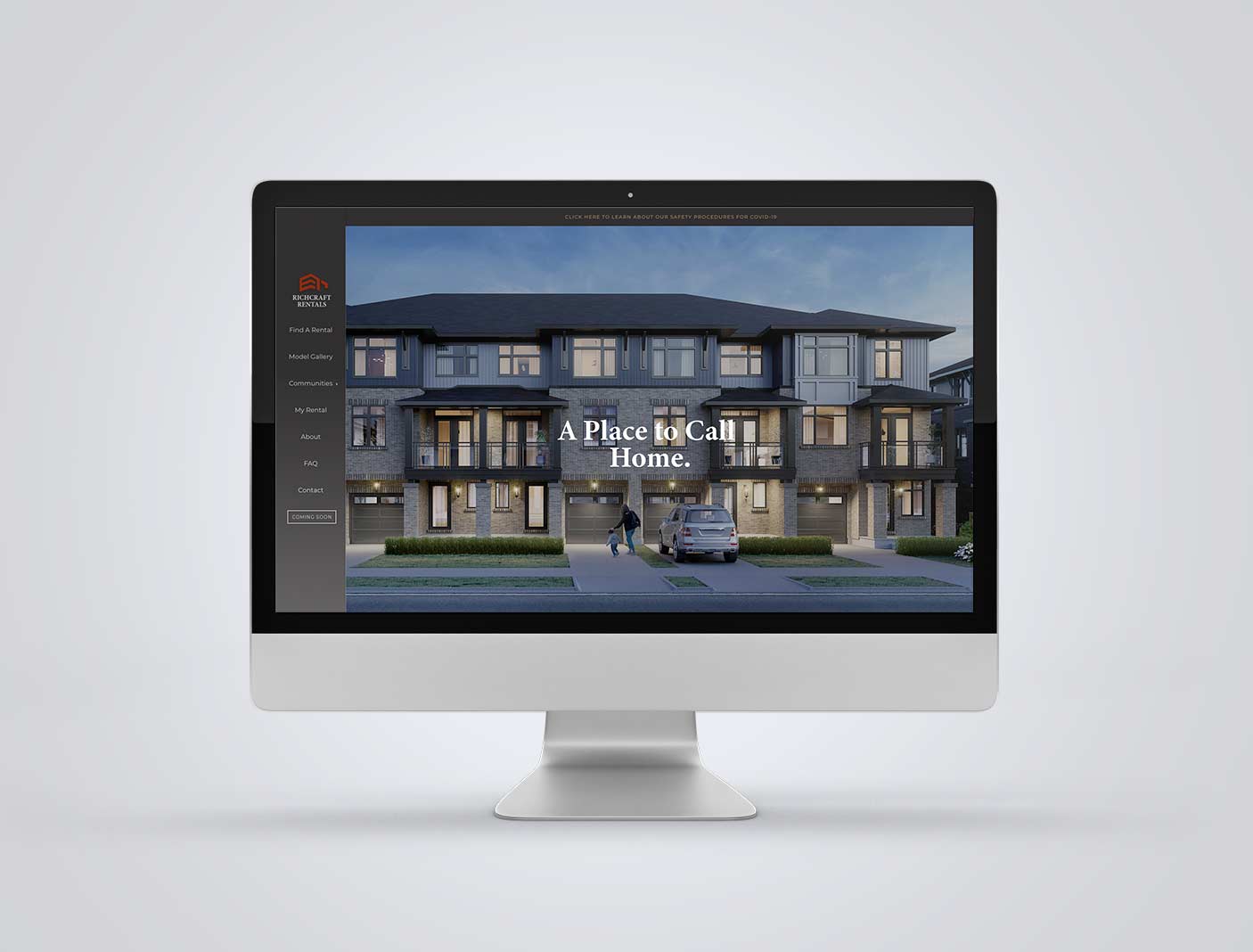
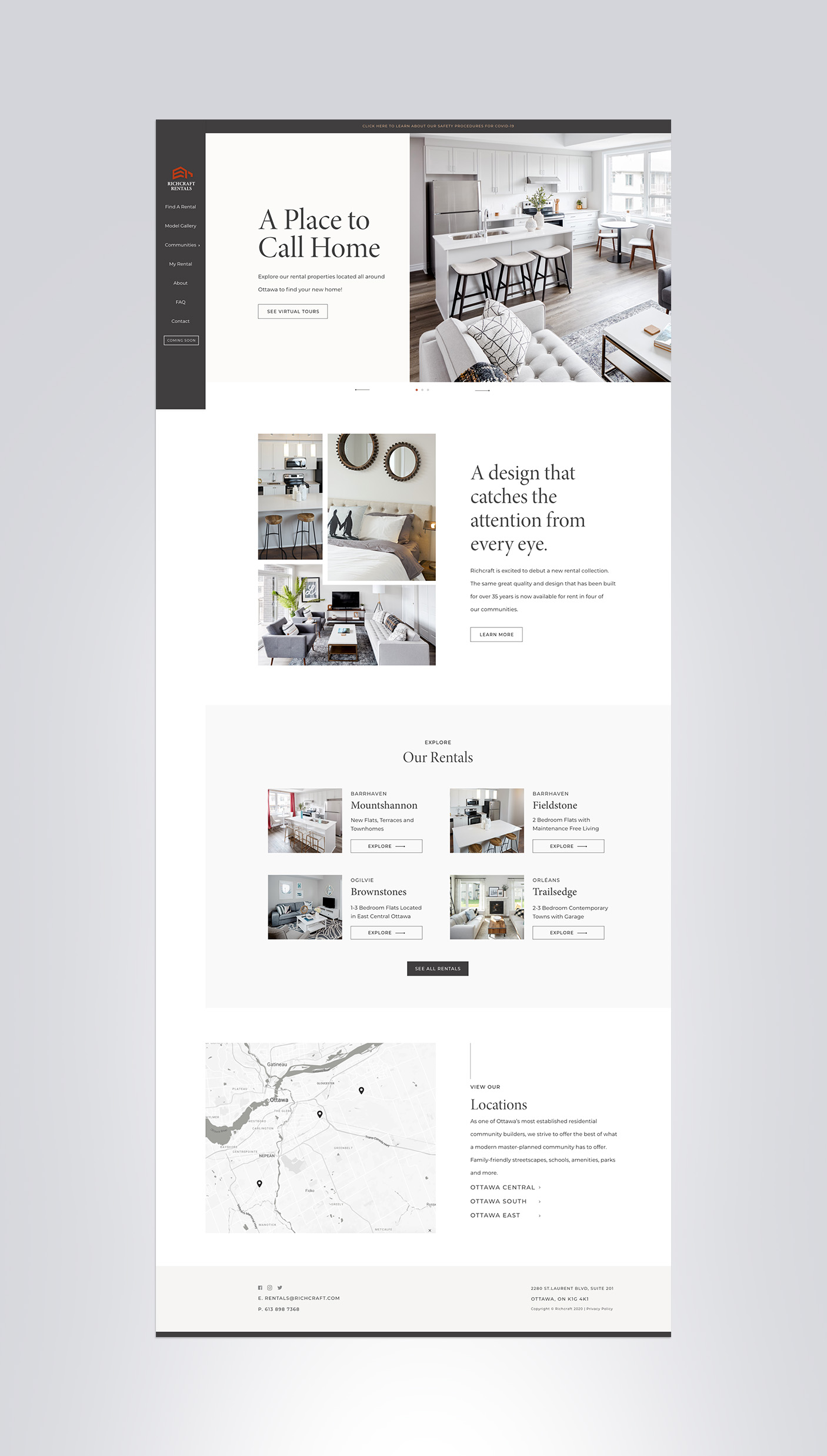
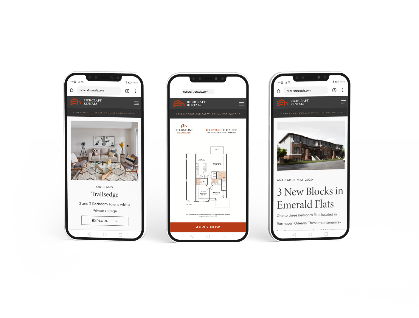
The goal was to give Richcraft Rentals a new look that complemented the new Richcraft Homes website while maintaining its own unique identity. Richcraft also introduced a new rental portal that needed to be implemented in the new design.
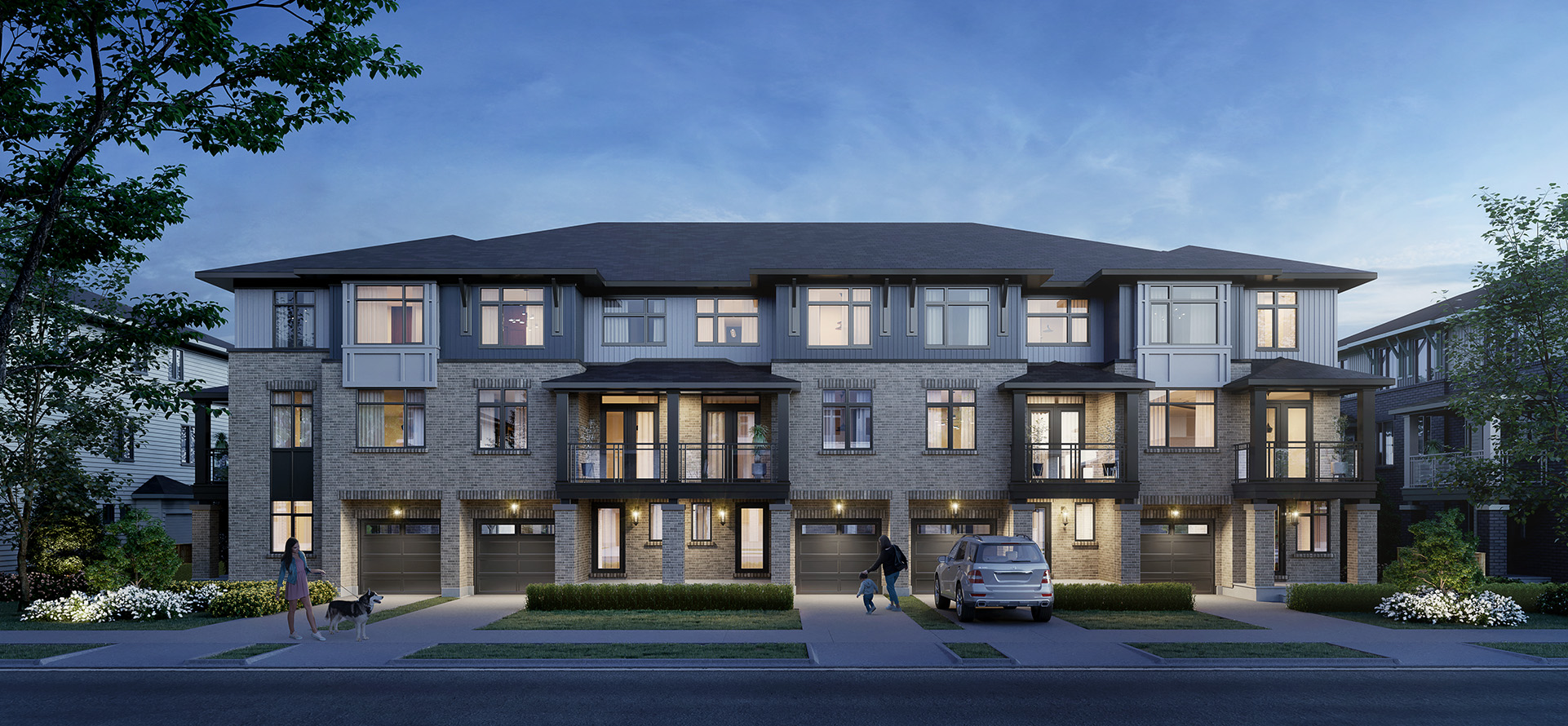
One of the challenges was to elevate the rental’s orange and grey brand colours to communicate a luxury product. We decided to introduce cream and soft grey to balance out the boldness of the orange and dark grey. We relied heavily on showcasing the product, which is the showstopper and introduced a modern serif font that complemented the Richcraft Rentals logo.
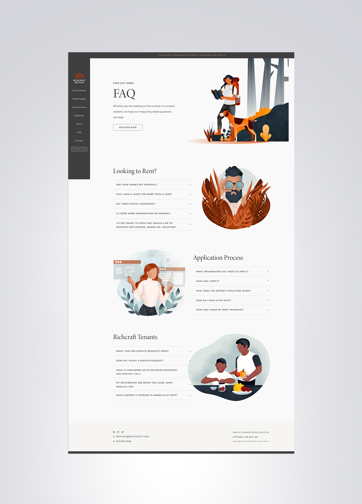
Another addition to Richcraft Rentals was introducing illustrations. A particular style was selected for rentals, and I was excited to further my skill in illustration and take on this new challenge. The illustrations were introduced to convey a softness and approachability to the brand, but in a style that still portrayed elegance and luxury. The UX was focused on getting users to easily be able to browse new communities and ultimately register to be contacted.

